Denis Montel discusses his design for Hermès’ bond street London flagship store
Artistic director and architect of paris-based studio RDAI architecture, Denis Montel is known for his longstanding collaboration with french luxury fashion house Hermès.
Having designed the interiors for their boutiques in New York, Paris, Tokyo –to name a few– the latest revitalization is their central London flagship store. Located in a listed building on the corner of new bond and bruton streets, the project saw the retail space doubling in size while existing and new elements were added. Elegantly embracing the aesthetics of the iconic french brand, Denis Montel has created a refined and contemporary backdrop to the diverse array of fashion, accessories and homeware products presented.
How have you translated the themes associated with the Hermès brand into the design of the flagship store?
Denis Montel: the main theme associated with the Hermès brand in this particular flagship store is the “flânerie “, especially on the first floor where the customer is invited to stroll and discover.
Can you talk about how the individual products are presented as part of the store’s overall layout?
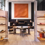
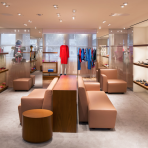
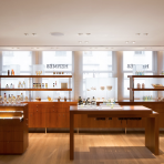
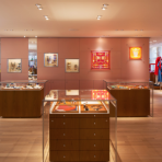
DM: the whole ground floor is dedicated to the men’s universe with the exception of feminine silk that we find at the entrance. thus the whole silk of men and women are grouped together in the first area in the entrance. the first floor is more feminine and at the center of women’s ready to wear, we have a specific shoe salon. the fragrance is presented on a long piece of furniture, designed especially for this project. this furniture is positioned in front of windows allowing to showcase perfumes playing with transparency and light. all the “métiers” positioned in front of the long window facade have specific furniture meanwhile, the maison area is specific to this project because it is in a classified area.
How much of a challenge was it to implement such a project within the constraints of the original listed building?
DM: implementing such project within the constraints of the original listed building was an interesting and rewarding challenge. we wanted to create a store in contrast to the mineral and square building from the 1950’s, to bring a certain lightness, softness, and even femininity.
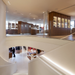
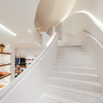
so we have implanted some curved form and a color palette with these characteristics. existing constraints, such as a small ground floor with a spacious first floor with a large terrace has helped to guide our project. in particular, the implementation of the staircase against the back wall, both present and open, was a key element of this project. the oval shape of the void has a beautiful opening on the first floor and invites the visitor up to natural light which we have enhanced with a round ceiling opening.
Is there a specific part of the project which you are particularly proud of?
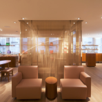
DM: we wanted the two spaces to be bathed in natural light. it will have a beautiful clarity and even some whiteness. the work of the staging of the light on the first floor was essential, we did not want to have back light. so we made this creation of customized metal textile with a french designer, Sophie Mallebranche, specifically for this store, a gradation of tones of copper and pearl white. the presence of this refined filter in front of the long line of windows allowed us to develop
a sweet and sparkling atmosphere while providing some privacy in these spaces.
many materials vary throughout the day and create different atmospheres according to the light. thus, at night, the store is dressed in an evening suit of lights. it was also important that the classified area maison fits well with our contemporary architectural approach.
How does this london store differ or compare to other interiors that you have completed for Hermès?
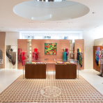
DM: this store is different mainly by the qualities of spaces but also by materials and the color range used. the desire for clarity is reinforced on the ground floor with a very clear terrazzo punctuated with saint louis crystal sparkle, pink sand, copper and white silver crystal sheets. marmorino traditionally used in a beige tone in hermès stores here is much whiter. on the first floor we have the sweetness of a natural oak floor.
on both floors we have the presence of large panels which have three layers, the first is an acid etched panel, the second is a filter with a color of copper pink that harmonizes with the coloration of metallic textile and the third is a mirror. the glass elevator is also integrated with this metal textile, deployed in a gradient on the two levels that allows you to discover the store as you go up.
All images courtesy of hermés
Editorial: Design Boom
